Statistical tests without the traps

In Post 3 we explored the Adult Census Income dataset through distributions, correlations, and outlier fences, learning to let the data speak before we model it. Now we put that exploratory foundation to work and ask the question every data scientist eventually faces: is the pattern we see real, or is it noise? This post builds a complete statistical testing workflow on the same 32,561 rows, and by the end we will have separated the 30.6 percent male high-income rate from the 10.9 percent female rate with a p-value that rounds to zero, while learning why that number alone is not enough.
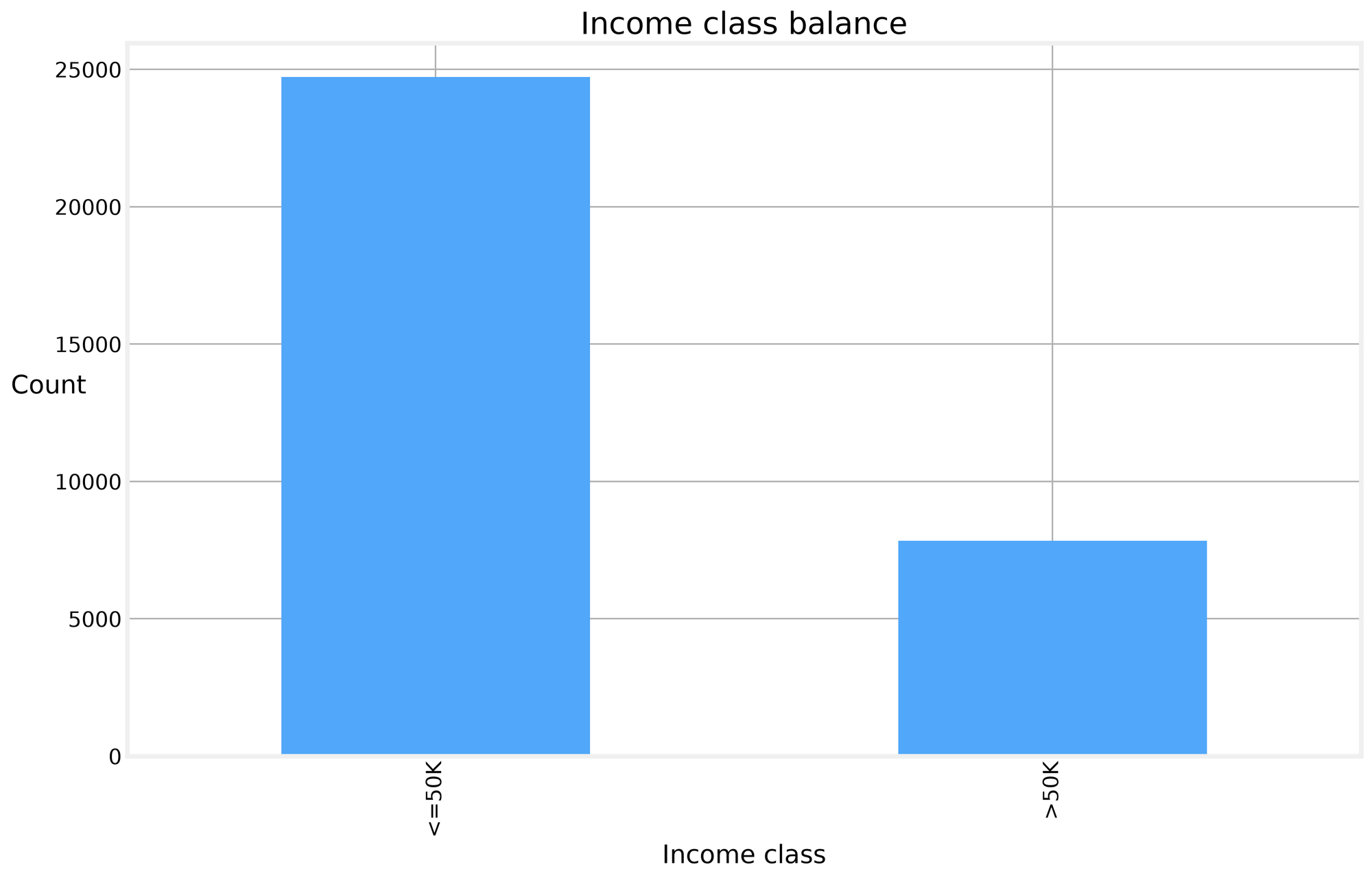
The raw UCI Adult Census Income file has about 48,000 rows; after Post 3's cleaning, the working frame has 32,561 rows of census responses with age, education, occupation, and income class. We start from a tidy frame with a binary high_income column and a base rate of 24.08 percent. That base rate matters: every test we run in this post gets read against it, and every conclusion we draw has to survive contact with the fact that three quarters of the sample earns under 50K.
The data
Before any testing, we need to know what we are working with. The EDA in Post 3 left us with four findings that shape everything that follows. First, the high-income base rate sits at 24.08 percent, so any claim about income gaps has to be measured against that floor. Second, capital-gain and capital-loss are zero-inflated: most people report no capital activity at all, which makes nonparametric tests safer for anything involving those columns. Third, education and education-num are redundant, so we use the readable labels for grouping and the numeric version only for summaries. Fourth, the sample is large enough that tiny differences will produce tiny p-values, which means we report effect sizes alongside every test.
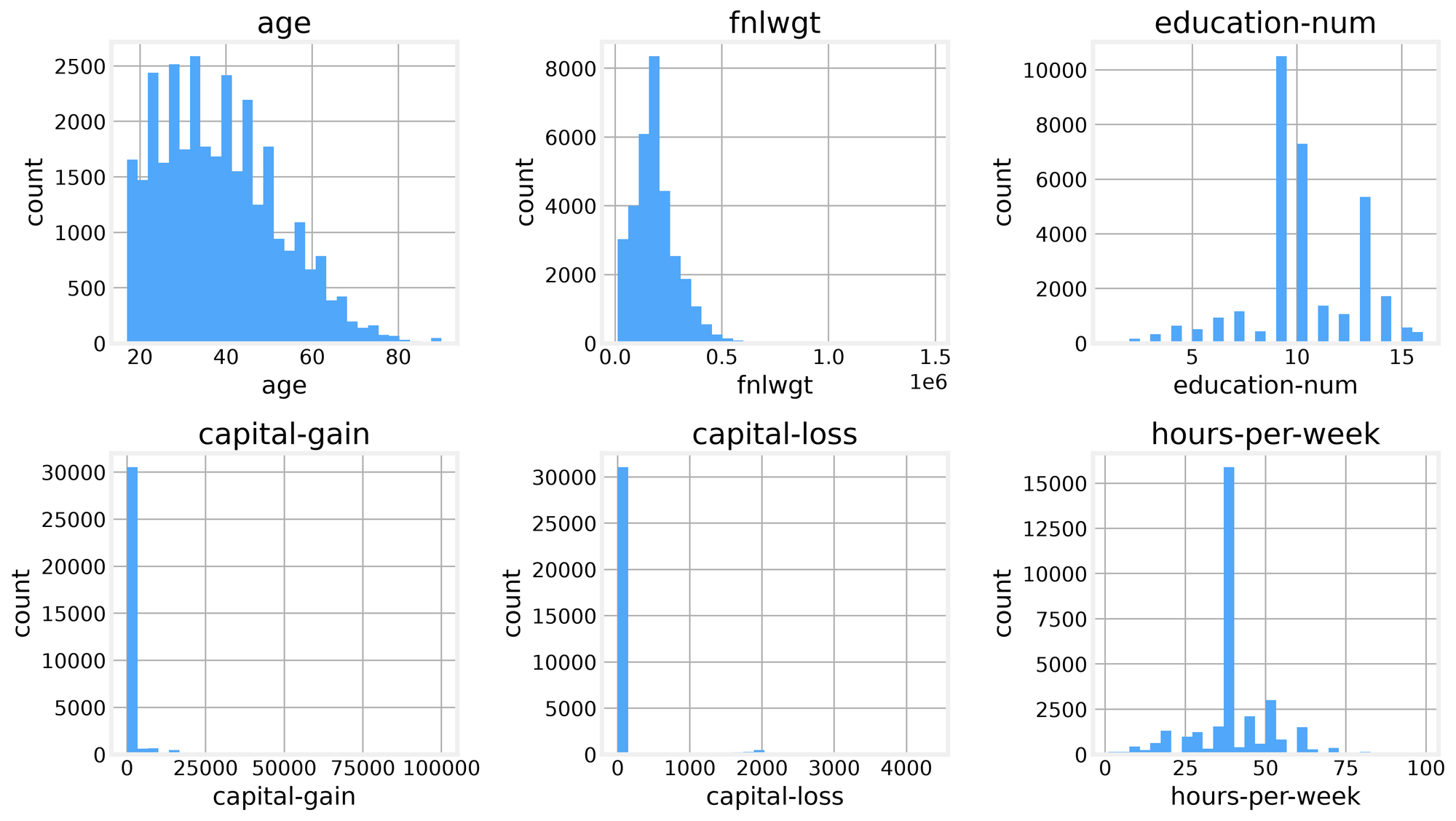
The histograms from the EDA show the shape of the problem. Age is roughly right-skewed, hours-per-week clusters around 40 with a long tail of overtime workers, and capital-gain is a spike at zero with a thin positive tail.
Age leans right, hours cluster at 40, and capital-gain is a spike at zero.
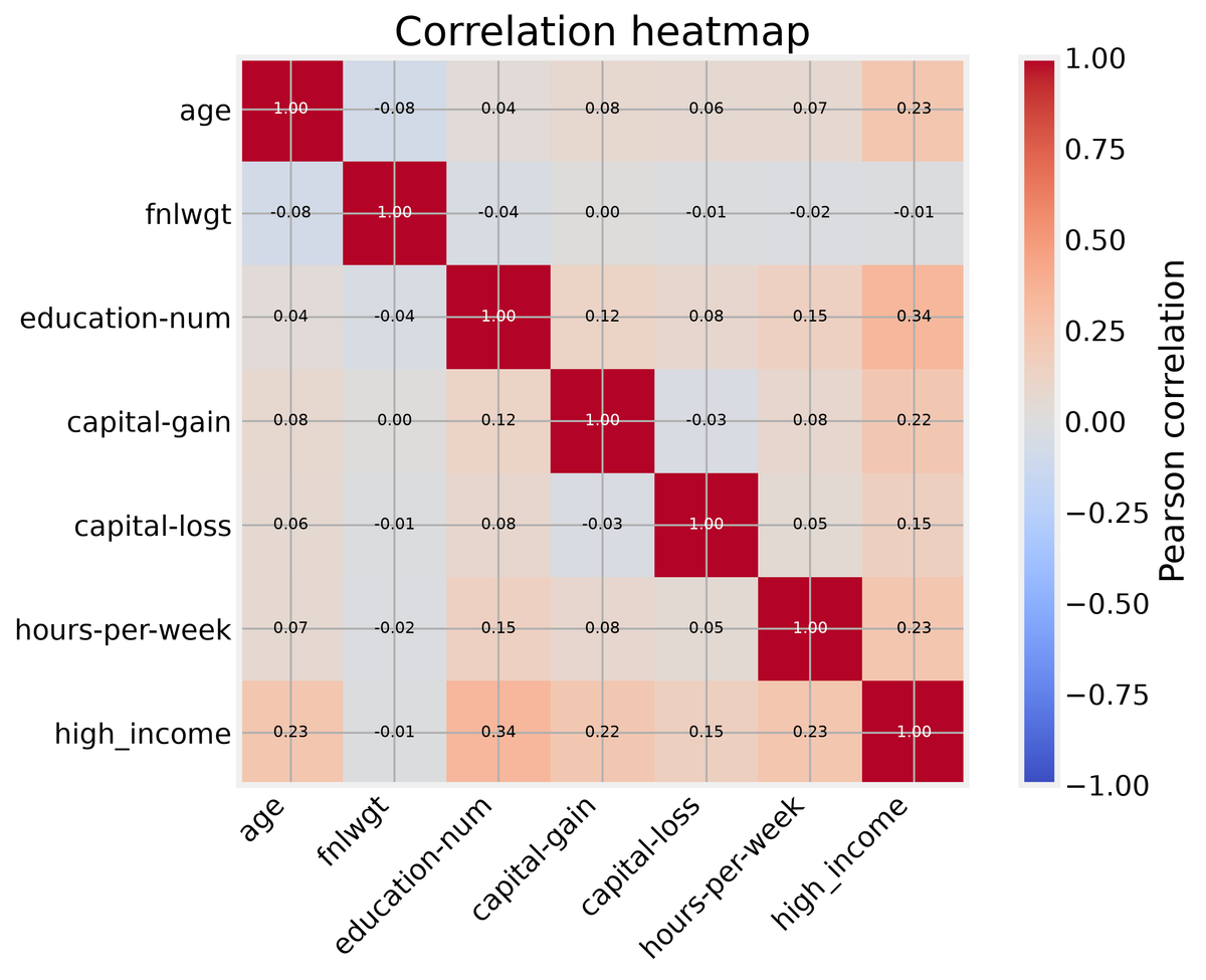
The correlation heatmap confirms what we suspected: no single numeric feature dominates income, and the strongest relationships are modest. That is the setting for statistical testing, a dataset where the signal is real but small, and where the sample size can make almost anything significant.
The correlations are all modest; no single feature dominates income.
Testing basics
Hypothesis testing starts with a null hypothesis and asks whether the observed data are surprising under it. The p-value is the probability of seeing a result as extreme as the one we got, assuming the null is true. A Type I error is rejecting a true null, and a Type II error is failing to reject a false one. Statistical power is one minus the Type II error rate, the probability that we catch a real effect when it exists.
These definitions are easy to recite and easy to misunderstand, so we simulate them. We draw two groups from normal distributions, run a t-test on each pair, and record the p-values. Under the null, with no real difference, the p-values should be uniform: any value between zero and one is equally likely.
def simulate_tests(effect=0.0, n=50, iterations=1000, alpha=0.05, seed=42):
    rng = np.random.default_rng(seed)
    pvals = []
    for _ in range(iterations):
        a = rng.normal(0, 1, n)
        b = rng.normal(effect, 1, n)
        _, p = stats.ttest_ind(a, b)
        pvals.append(p)
    return np.array(pvals)
Running this with effect zero gives an observed Type I error rate of 0.047, right where it should be for alpha 0.05. Running it with an effect of half a standard deviation gives power 0.716, meaning we catch the real difference about 72 percent of the time and miss it 28 percent of the time. The p-value histogram under the null is flat, which is the whole point: when nothing is going on, every p-value is equally likely.
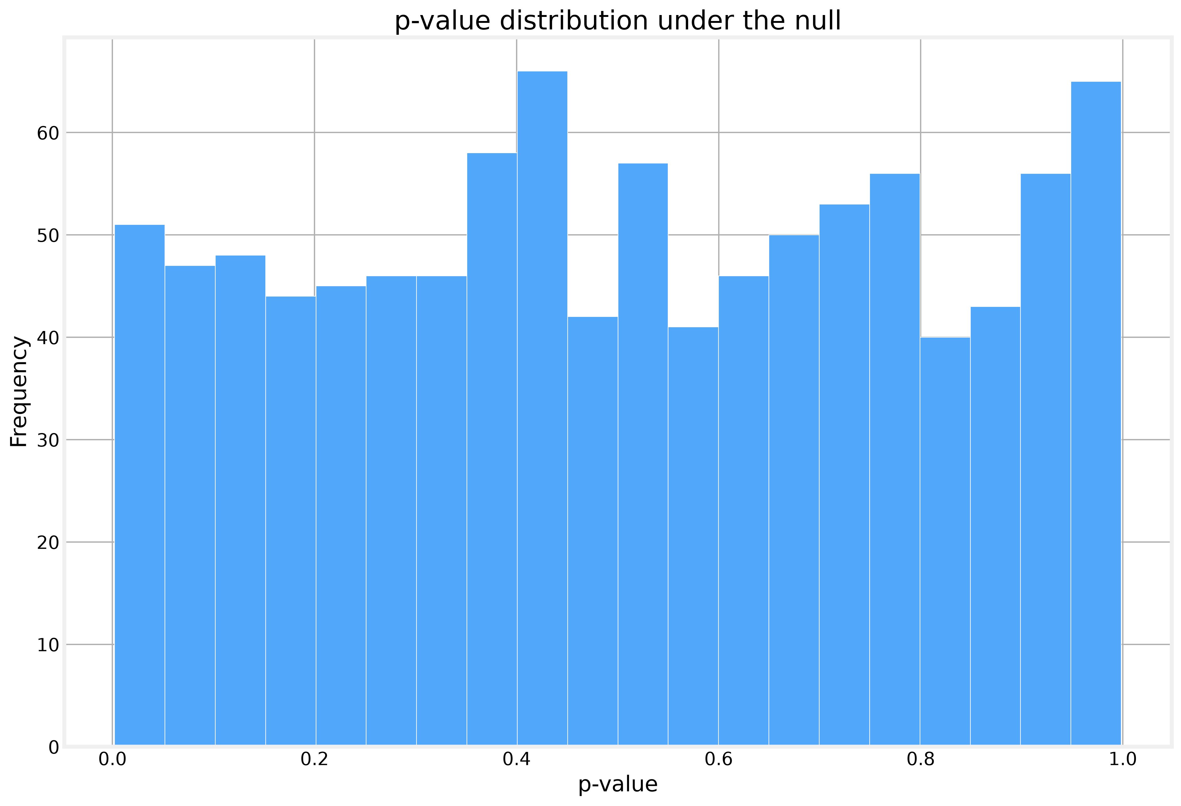
The p-value histogram is flat, so every p-value is equally likely under the null.
That flat histogram is the trap. A p-value of 0.04 under the null is not evidence of anything. It is just one draw from a uniform distribution. The discipline of testing is deciding before you look what threshold you will use, and accepting that 5 percent of true nulls will look significant anyway.
t-tests
t-tests compare the means of two groups. Student's version assumes equal variances, which is rarely true in real data, so we use Welch's t-test, which does not. The sex gap in high-income rates is the natural first test: 30.57 percent of men earn over 50K, against 10.95 percent of women.
male = df_clean[df_clean['sex'] == 'Male']['high_income']
female = df_clean[df_clean['sex'] == 'Female']['high_income']
t_stat, p_val = stats.ttest_ind(male, female, equal_var=False)
The t-statistic comes out at 45.28 and the p-value is so small the software reports it as zero. But the effect size tells a different story. Cohen's d (the distance between the two group means, measured in standard deviations) is 0.499, a medium effect by convention, which means the two distributions overlap substantially. The gap is real and it is not trivial, but it is also not the chasm the p-value suggests. Large samples make small differences detectable, and detectable is not the same as large.